Back to Black

Art Direction, Type / Layout, Graphic Design

Project Overview

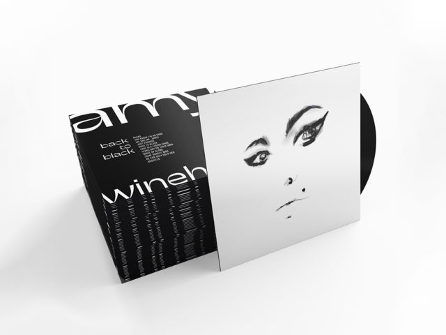
A redesign of Amy Winehouse's seminal 2006 record, Back to Black. The goal was to create an album cover that reflected the music—its timeless sound, paradoxical moods, layered instrumentals, rich vocals, and emotional rawness.

Challenge

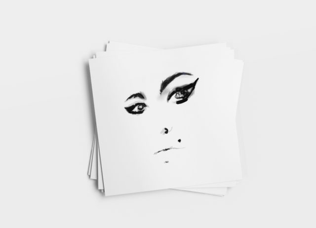
The original cover art for Back to Black never seemed to do the album justice. It never felt as big as the music it held, or as arresting and raw as Amy’s presence. I wanted to create an album cover that captured her essence, something both heartbroken and defiant.

Solution

While I’d always listened to this album on a surface level, just enjoying how it sounded, I never had a reason to take a very deep dive into the music. As jazzy and poppy as the album might sound, the lyrics conveyed a reservoir of layered, complex, and conflicting emotions that give the listener a glimpse into her soul. I took a cue from that and decided to strip away color, ornamentation, and just create a layered portrait of her, infusing as much depth through different brushes as I could.