Koi Food Truck

Branding, Illustration, Packaging, Graphic Design

The izakaya on wheels

Project Overview

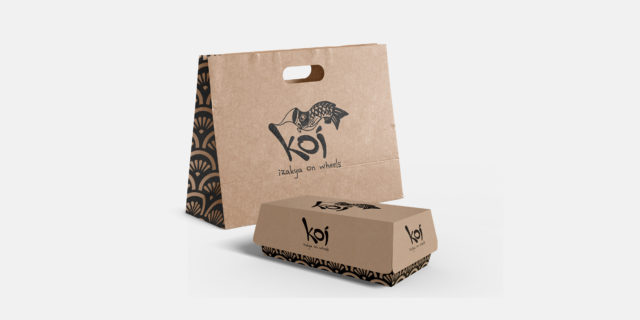
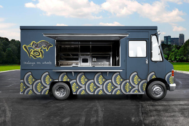
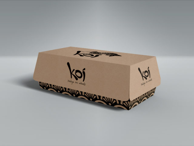
Koi is a product of the growing popularity of izakayas (Japanese pubs) and the trendiness of food trucks. The brand evokes the laid back, casual, and friendly feel of traditional izakayas along with Japanese aesthetics to be authentic and approachable.

Why Koi?

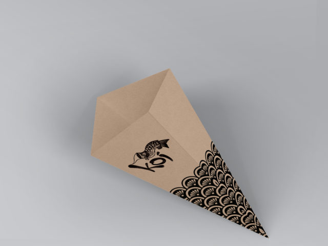
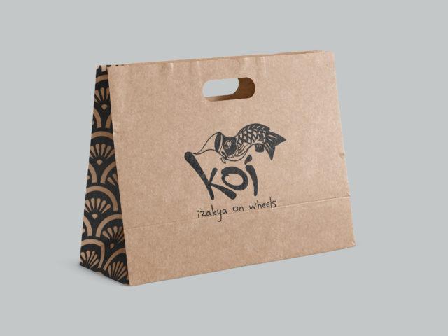
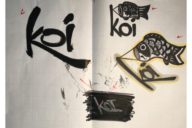
In Japnese culture, the Koi is a symbol of good luck, abundance, and perseverance. The logo design, scale pattern, and color palette are inspired by the Koi streamers (Koinobori) that are flown on Children's Day in Japan.

Sketchy Process

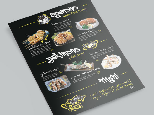
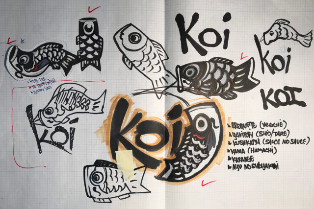
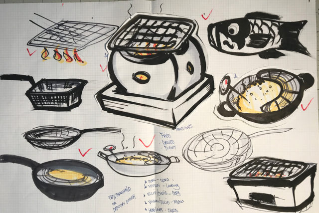
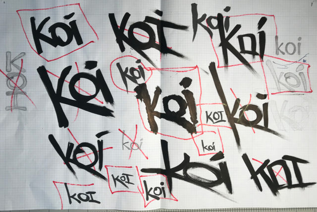
Sketching and brainstorming are my favorite parts of the design process. I get to nerd out and draw, throwing as much as I can on the wall and see what sticks. While doing our initial research for Koi, we noticed that many izakayas use hand-written signs and menus. We wanted to bring that into the brand, so all the hand lettering and illustrations imitate Japanese calligraphy to give that authentic izakaya experience.