Background
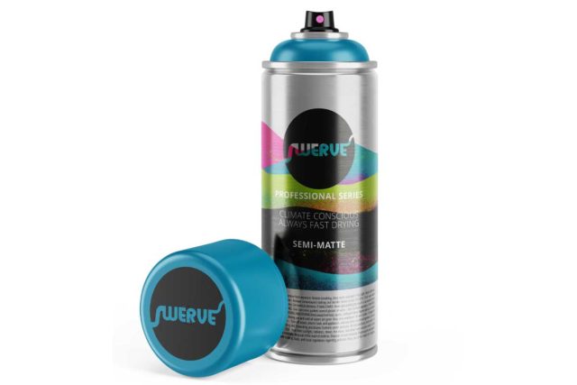
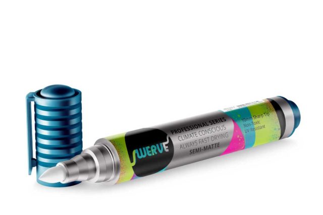
For about 5 weeks we had a time-table to create a logo and package design based on a mood board. A large obstacle in this is the HUGE block of text that the safety warning occupies. Does anyone actually read it? Well, just in case, it had to be legible, but still not take up enough space to overwhelm the design.
Process
I really wanted to have a mix of splattered texture, overlap, and some aspect of minimalism (cuz that says premium, right?) That’s a lot to bargain for. Backgrounds were made in Procreate and once I found one that worked I went into layout and type. I found a compromise to the minimal look was to have raw can visible. No other can was doing that.
Solution
For the HUGE block of text, I held a can and thought about how it looks in the hand and not on the shelf (the cans are displaced cap out–so the label isn’t even visible until you can actually pick it up). My idea was to wrap it around the bottom of the can, so the can would look nice on every side.
While the raw metal and type layout might be risky, from interviewing folks at Art Primo, this would actually appeal to the actual artists would would purchase it.


